Forum Update: Supporting Community-Led Discussion
The forum was created as a space for shared learning and peer support, and as the community grows, we want to lean more fully into that purpose.
Going forward, PAAB will be taking a more listening-first role in forum discussions. Rather than responding immediately to every question, we’ll be encouraging members to engage with one another, share experiences, and help build collective understanding. PAAB will continue to monitor conversations and will step in to:
- Correct any misunderstandings
- Provide guidance when questions remain unanswered after a few days
- Support discussions where official clarification is needed
Our goal is to foster a collaborative, trusted community where knowledge is shared and strengthened by everyone’s contributions.
Thank you for being part of the conversation.
NEW PAAB Logo Revealed
-
Good Morning @Agency and @Manufacturer
To show our appreciation to your dedication to staying informed and up to date on all things PAAB by registering for the PAAB Forum, we wanted to share the new PAAB logo with you FIRST!
So without any further wait, here it is:

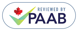
Let us take you through a summary of the significance of each aspect of the design elements.
Background colour: From both a design and versatility perspective, it was decided that the background colours should remain white. This makes the logo clear and consistent across pieces regardless of the surface of the ad to help HCP’s and patients efficiently identify credible information about health care products.
Maple Leaf: In recognition that PAAB is a Canadian company working in the best interest for the health and safety of Canadians, it was deemed pertinent to keep the maple leaf to easily identify PAAB as Canadian. The rationale for the maple leaf above the checkmark allows for ONE iconic representation for the PAAB instead of 2 separate icons.
Checkmark: To improve on the logo, the checkmark was added to visually signify that the piece had met a standard for acceptability. This in combination with the PAAB acronym ties the preclearance of the piece back to the PAAB code and organization. Green colouring was added to help further elicit the feeling that the content is trustworthy and supports health and safety.
Words: To pull the logo together and more clearly convey the independent review service that PAAB provides, the copy “Reviewed by” has been added.
What should it mean to me to have the PAAB logo affixed to promotional information we have produced?
It indicates that this information is truthful and trustworthy as it has been independently reviewed to meet high standards.Why should this matter to me?
High quality information is at the core of state-of-the-art patient care.Why is the PAAB logo changing?
Easier identification of promotional information that has been independently reviewed to support health and safety of Canadians.The PAAB is grateful to all the participants of the Logo Committee for their contributions in creating this new logo and to cdm Montreal for the new logo. If you’d like to read more about the Logo Committee and the work they did to develop the new logo, please read more about it here. Over the upcoming days we will be sharing more information about this initiative across all our communication channels.
-
Thanks @palanski . We have plans to roll all the information required out to you over the coming weeks, but since you asked, we won't start using this logo until October 1st.
-
Thanks for sharing. It looks great!
I have to assume prior to roll-out, there will be a French version, as well as a bilingual version available? As our agency is preparing for tools in the fall, I'd like to ensure I can get these to my team as soon as possible. Thanks in advance for any insights you can provide on this.
Andrew Brest -
Thanks for sharing. It looks great!
I have to assume prior to roll-out, there will be a French version, as well as a bilingual version available? As our agency is preparing for tools in the fall, I'd like to ensure I can get these to my team as soon as possible. Thanks in advance for any insights you can provide on this.
Andrew BrestYou are correct @Andrew-Brest. We’ll be rolling out the French and the English, as well as posting the files to our site and the style guide with plenty of run-in time to prepare tools for the fall. In fact, I’ve included the French below so you can see what it looks like.

We do have a bilingual logo prepared, however we have received mixed reviews on if we should proceed with the use. We’d be interested to hear your opinion and the opinion of anyone else on the forum. Let us know your thoughts.
-
Thanks Jennifer. Could I see the Bilingual - I assume it would have English on one side of the Maple Leaf/Check and French on the other? I think it's important that we consider bilingual for some tools that are developed this way: perhaps at least as an option? Thank you for your response.
-
Thanks Jennifer. Could I see the Bilingual - I assume it would have English on one side of the Maple Leaf/Check and French on the other? I think it's important that we consider bilingual for some tools that are developed this way: perhaps at least as an option? Thank you for your response.
Here you go @Andrew-Brest

-
I think it looks great...only thing I would change is that I wouldn't have the check-mark overlapping the letters - in either the English or the French or on either side of the bilingual version. It's such a small overlap that is actually looks like a mistake (an oversight on the artwork)...just my opinion. Thanks for sending along.
-
Here you go @Andrew-Brest
@Jennifer-Carroll I've solicited feedback from ANTIBODY's Creative Director, Melisa Barrilli, who had the following thoughts to offer on the bilingual logo:
Although we rarely use bilingual logos, they do come in handy. Glad a version was created! The bilingual logo seems to have optimized the space and flows well. Legibility seems excellent for the PAAB/CCPP words. It will be interesting to see how all versions look when applied at their minimum recommended size—there's considerable size variation with the smaller type, so "Reviewed by" may become illegible if used too small.Hope this is useful!