
Clarification on Logo Sizing
-
See revised size minimums in comments below this post
Clients have been asking for further elaboration on the Logo Guideline copy “Sizing should always be determined based on proper legibility” so we have consulted some design experts and produced the following guidance on minimum size / resolution.
Digital
The minimum size of the logo should be 100 pixels (72 dpi). As pieces scale up, a logo size which interacts appropriately with other elements in close proximity should be used on all pieces. In pieces less than 600 x 600 pixels, the minimum size of the PAAB logo which will remain legible is 75 pixels (72 dpi).Print
For pieces with a width of 8.5” or greater, the logo should appear with a width of 1.25”.For the purposes of print, anything with a width below 8.5” will be considered a small space ad. On the surface of these pieces, the minimum logo size should be a width of 0.9”. -
See revised size minimums in comments below this post
Clients have been asking for further elaboration on the Logo Guideline copy “Sizing should always be determined based on proper legibility” so we have consulted some design experts and produced the following guidance on minimum size / resolution.
Digital
The minimum size of the logo should be 100 pixels (72 dpi). As pieces scale up, a logo size which interacts appropriately with other elements in close proximity should be used on all pieces. In pieces less than 600 x 600 pixels, the minimum size of the PAAB logo which will remain legible is 75 pixels (72 dpi).Print
For pieces with a width of 8.5” or greater, the logo should appear with a width of 1.25”.For the purposes of print, anything with a width below 8.5” will be considered a small space ad. On the surface of these pieces, the minimum logo size should be a width of 0.9”.Hi Jennifer, I have a quick question regarding the new logo guidance for print pieces. We are in the middle of updating the PAAB logo for a number of clients and are finding the size guidance for the new PAAB logo too big (in some cases it becomes bigger then our client logos). Is there any flexibility when it comes to sizing of the logo? Thanks for your feedback.
-
Hi Jennifer, I have a quick question regarding the new logo guidance for print pieces. We are in the middle of updating the PAAB logo for a number of clients and are finding the size guidance for the new PAAB logo too big (in some cases it becomes bigger then our client logos). Is there any flexibility when it comes to sizing of the logo? Thanks for your feedback.
Hi @Kandrews
We set the sizing based on consultation pertaining to the request for additional guidance around the requirement that the logo be "legible". Having said that, we are in very early days of the launch so we can certainly consider tweaks in style guidelines. Keep in mind that legibility is the main criteria (rather than exact sizing thresholds).
If you’d like to send us some examples or propose solutions for consideration, please reach out to me at jenniferc@paab.ca .
-
Hi @Kandrews
We set the sizing based on consultation pertaining to the request for additional guidance around the requirement that the logo be "legible". Having said that, we are in very early days of the launch so we can certainly consider tweaks in style guidelines. Keep in mind that legibility is the main criteria (rather than exact sizing thresholds).
If you’d like to send us some examples or propose solutions for consideration, please reach out to me at jenniferc@paab.ca .
@Jennifer-Carroll
Thanks so much Jennifer - really appreciate your offer of collarboration. We will put a reco together based on our experience to date and send it your way for review. Thanks again and talk soon! -
Logo size: @Agency and @Manufacturer
We’ve heard that, upon implementation of the PAAB logo guidelines, clients have encountered challenges in APS design. In response to this client feedback, we have revised our minimum size guidelines (see below). The following size requirements were constructed in collaboration with some clients and reviewed by others. The following minimum sizes have been selected to balance ease of adherence to sizing requirements with the logo’s effectiveness in conveying that the APS has been independently found to meet high standards for credibility and trustworthiness. This guidance is effective immediately. For clarity, it will be incorporated into the style guide by next week.
-
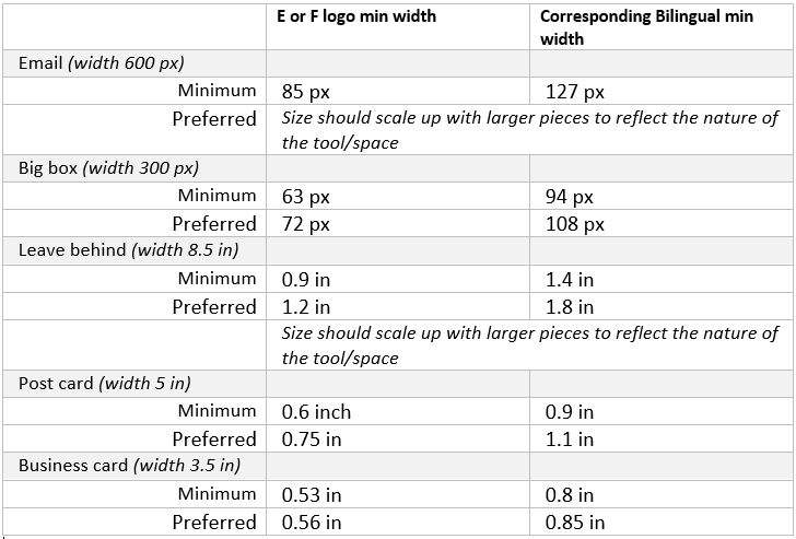
Big Box (300 px X 300 px) = min 63 px wide;
or preferred width of 72 -
Email (width of 600 px) = 85 px wide;
-Size should scale up with larger pieces to reflect the nature of the tool/space -
Leave-Behind (width of 8.5 in) = minimum width of 0.9in;
or preferred width of 1.2 in
-Size should scale up with larger pieces to reflect the nature of the tool/space -
Post card (width of 5 in) = minimum width of 0.6 in;
or preferred width of 0.75 in -
Business card (width of 3.5 in) = minimum width of 0.53 in;
or preferred width of 0.56 in
-
-
@Jennifer-Carroll These new guidelines have been very helpful. Thank you so much for the update!
Question for use of the bilingual logo. Do we have any updated sizing for that one specifically since it's wider then the separate EN and FR ones? "
Thanks!
-
@Jennifer-Carroll These new guidelines have been very helpful. Thank you so much for the update!
Question for use of the bilingual logo. Do we have any updated sizing for that one specifically since it's wider then the separate EN and FR ones? "
Thanks!
Great question @rebeccaallen
For simplicity, we have constructed the chart below:
-
Great question @rebeccaallen
For simplicity, we have constructed the chart below:
@jennifer-carroll Thanks so much Jennifer!! We've recently been adding PAAB to more websites recently. Do we have any sizing guidance for web, or just emails?
Appreciate any guidance that we can pass on to our developers. Thanks!
-
@jennifer-carroll Thanks so much Jennifer!! We've recently been adding PAAB to more websites recently. Do we have any sizing guidance for web, or just emails?
Appreciate any guidance that we can pass on to our developers. Thanks!
@rebeccaallen great question. The requirements behind the logo size are to ensure that aspects of the logo remain legible in use. We set minimums for smaller tools to help facilitate this practice. For larger tools such as websites, the 85px size applies as a minimum with the preference being that the logo would be scaled up appropriately for larger tools. This means that a mobile webpage would likely still be appropriately 85px however a desktop could be increased to improve legibility and promote the sponsors willingness to participate in the independent review process.